浏览器自动填充和记住密码行为是前端遇到最为头疼的问题之一,浏览器只要检查到
passwordinput框,就会匹配离他最近的textinput框,autocomplete属性虽能解决自动填充的问题,但是也是支持有限,不能解决浏览器记住密码行为和提示密码行为要解决这种问题,可以从
passwordinput框入手,只要改变 input框的类型为text就可以解决此问题第一种:设置样式
设置input 类型为
text后,给此input设置样式-webkit-text-security:disc即可,但是,这种样式兼容性不好,只支持以下浏览器版本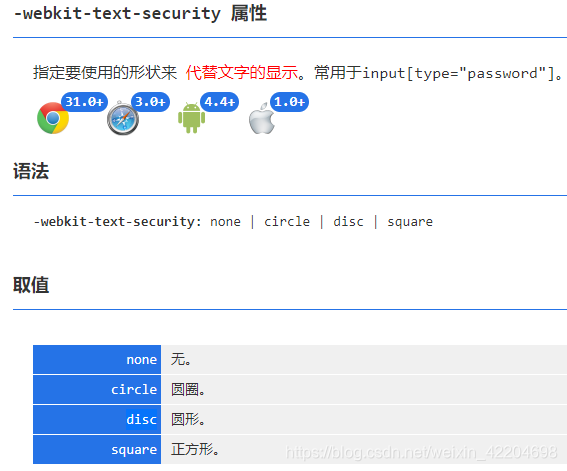
第二种:模拟密码框
思路很简单,真实input为
text的框输入并隐藏,相同位置展示密码圆点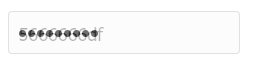
看代码:
html<div class="input"> <span class="password1" @click="setTimer"> <span class="iconfont" v-for="i in password.length" :key="i"></span> <!-- 模拟光标 --> <span v-show="isFocus" class="focusIcon"></span> </span> <input type="text" class="password" ID="txtPassword" MaxLength="26" v-model="password" autofocus @click="setTimer"> <!-- 光标之外点击蒙层 --> <div class="maskClick" @click="clearFocus"></div> </div>css
.iconfont {
  display: inline-block;
  height: 7px;
  width: 7px;
  margin-right: 2px;
  border-radius: 50%;
  background-color: #333;
}
#txtPassword {
  opacity: 0;
}
input {
  width: 220px;
  padding-left: 10px;
  padding-top: 3px;
  background: #fcfcfc;
  height: 38px;
  line-height: 43px;
  font-size: 18px;
  border: 1px solid #e1e1e1;
  border-radius: 4px;
}
div.input {
  position: relative;
}
div.input input {
  position: absolute;
  left: 0;
  z-index: 22;
}
.maskClick {
  width: 500px;
  height: 500px;
  position: absolute;
  top: -125px;
  left: -125px;
  z-index: 1;
}
.password1 {
  position: absolute;
  left: 0;
  z-index: 22;
  width: 220px;
  height: 38px;
  line-height: 33px;
  padding-left: 10px;
  background: #fcfcfc;
  border: 1px solid #e1e1e1;
  border-radius: 4px;
}
.focusIcon {
  display: inline-block;
  width: 1.5px;
  height: 20px;
  background: #606266;
  vertical-align: middle;
}
js:因为真实的input被隐藏,光标被隐藏,所以在这里模拟了光标的实现,不需要的可以省略光标部分代码
data () {
    return {
      password: '',
      isFocus: true,
      timer: null,
      timerOut: null
    }
  },
  methods: {
    setTimer (tag) {
      const that = this
      that.clearFocus()
      setTimeout(() => {
        that.isFocus = true
      }, 400)
      that.timer = setInterval(() => {
        this.isFocus = false
        that.timerOut = setTimeout(() => {
          this.isFocus = true
        }, 1200)
      }, 800)
    },
    clearFocus () {
      window.clearInterval(this.timer)
      this.timer = null
      window.clearTimeout(this.timerOut)
      this.timerOut = null
      setTimeout(() => {
        this.isFocus = false
      }, 20)
    }
  },
  mounted () {
    this.setTimer()
  },
  beforeDestroy () {
    window.clearInterval(this.timer)
  }
这样就简单实现了input密码框的模拟,当然密码显示样式可以根据自己需要随时更改,大家有什么好的实现方式欢迎讨论学习